Discover how colour psychology in interior design shapes mood, space, and comfort. Simple tips for hue, color schemes, light, and the right color for every room.
Welcome to the captivating world of colour psychology – where a “nice wall colour” isn’t just nice… it can calm you down, wake you up, make a small room feel bigger, and even change how cozy your home feels.
If you’ve ever walked into a room and instantly thought, “Ahh, this feels peaceful” or “Oof, this is too loud” – that’s psychology in interior design doing its thing.
In this blog, we’ll break down colour psychology in interior design in a super simple way:
- what it means
- why it matters
- how interior designers use the science of color + color theory
- and how you can pick the right color for each room without getting lost in the paint aisle
Whether you’re styling your own home or working with an interior designer in Kolkata, understanding colour psychology helps you make choices that feel right – not just look good.
(We’re Custom Design Interiors Pvt Ltd – Kolkata-based – and yes, we apply this every day in real homes. But today’s blog is pure value: your space, your way.)
What Is Colour Psychology and Why Does It Matter in Interior?
Colour psychology is basically the study of how colours can evoke emotions and influence behaviour. In a home interior design context, it helps us understand:
- why shades of blue feel calm
- why red can stimulate appetite or energy
- why some colours feel “bigger” and some feel “boxed-in”
- why the same hue looks different in morning vs night (hello, natural and artificial light!)
The importance of colour psychology in interior spaces
Think of it like this: furniture is the body, but colour is the mood. The psychological impact of colors affects:
- comfort
- focus
- sleep quality
- how welcoming a living room feels
- how productive your WFH corner becomes
So yes – color in interior design is not just decoration. It’s a design tool.
Understanding Colour Psychology: The Science of Color, Color Perception, and the Psychology Behind It
Here’s the simple truth: color perception isn’t fixed. It depends on:
- Light: How much light a color gets changes how it appears. The more light a color receives, the more “open” it can feel.
- Surface + finish: Matte vs glossy can soften color intensity or make it look punchy.
- Room size: Darker tones can feel sophisticated, but in tiny rooms they can feel heavy.
- Personal experience: Color meaning is also personal. One person finds yellow cheerful; another finds it stressful.
That’s why interior design is the study of balancing people + space + function + feeling. And interior design and architecture both rely on the role of color to create a complete experience.
Read more: Interior Design Trends in Kolkata in 2026
Role of Color in Interior Design: How Color Can Influence How People Feel
Let’s talk “real life.”
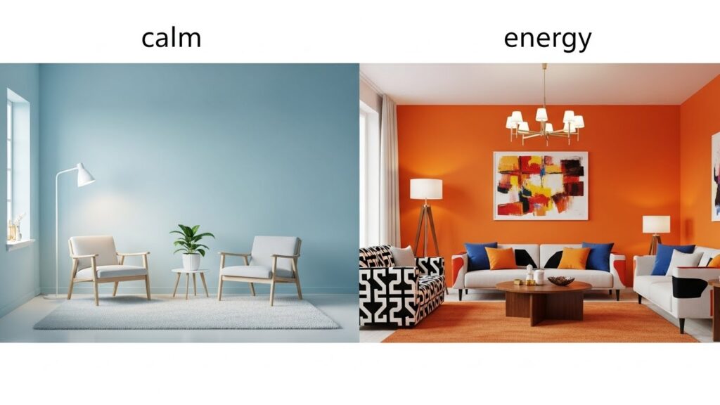
The role of color in daily mood
- Warm tones can feel lively and social
- Cool tones can feel calm and quiet
- Neutrals can feel timeless and versatile
- Bold accents can energize a space without overwhelming it
Psychological effects of color (quick guide)
- Red / color red / red is the color: energetic, intense, can stimulate; great as an accent color
- Orange (like red and orange): friendly, warm, playful
- Yellow: optimistic, bright – but too much can feel restless
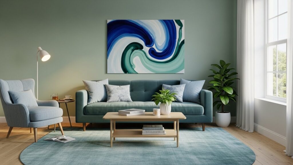
- Green: balanced, fresh, comforting
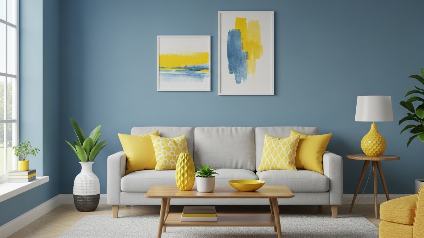
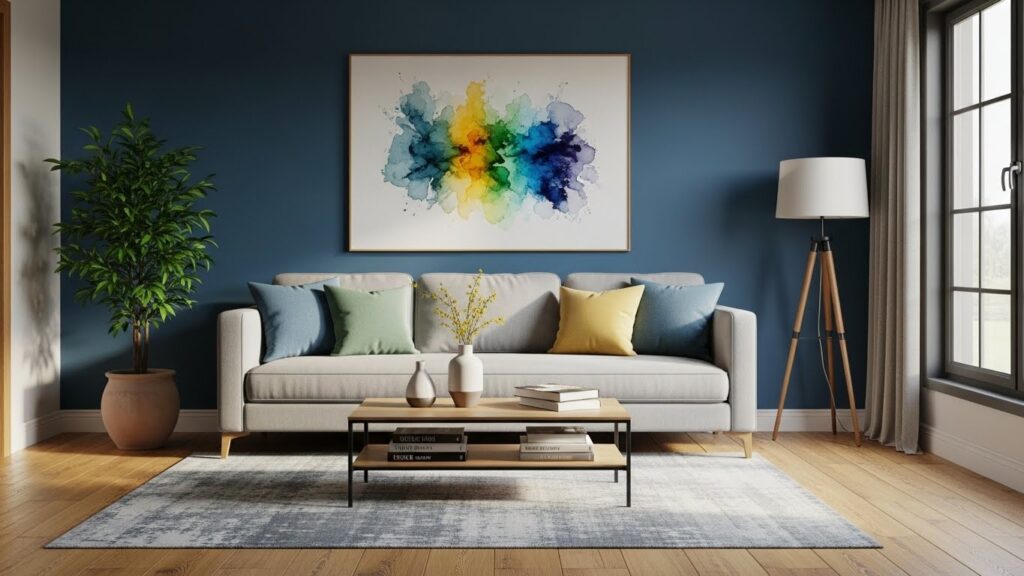
- Blue (shades of blue): calm, stable, great for bedrooms
- Purple: creative, luxurious, sometimes dramatic
- White / off-white: clean, airy, but can feel sterile if overused
- Grey: modern, sophisticated, but needs warmth to avoid dullness
- Black: high sophistication, strong contrast – best in small doses
This is how designers apply color theory to get the “feel” right, not just the “look” right.
Color Theory 101: Hue, Color Wheel, Colour Wheel, and Principles of Color
Before you choose a color palette, you need the basics – don’t worry, this won’t feel like school.
Hue (the real identity of a colour)
A hue is the pure colour family: red, blue, green, etc. When you add:
- white → tint
- black → shade
- grey → tone
That’s how you get softer or deeper color tones.
Color wheel / colour wheel basics
The color wheel helps you build a balanced design scheme using:
- primary color (red, blue, yellow)
- secondary colors (green, orange, purple)
- and mixes in between
Principles of color used in interior design
- Contrast (light vs dark)
- Balance (not too much of one tone)
- Harmony (colours that feel like they belong together)
- Accent (a pop that makes it interesting)
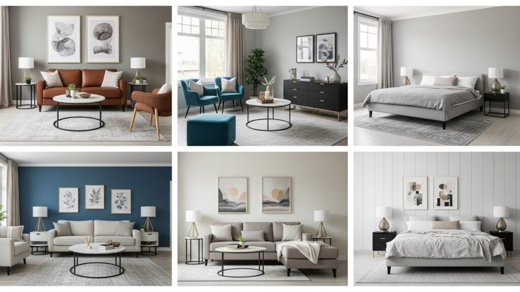
Color Schemes and Colour Schemes: Choosing a Color Scheme That Matches Your Design Style
This is where your home starts to look “designed” instead of “random.”
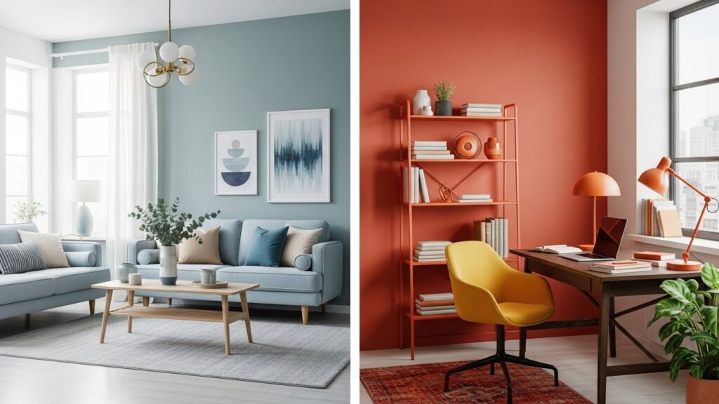
1) Complementary colors / complementary colour
These are opposite on the wheel (like blue + orange).
- Best for energetic spaces
- Works great when one is dominant and the other is an accent
Complementary colour schemes tip : Use one in a softer version and the other as an accent, so it doesn’t scream.
2) Analogous colour schemes
These sit next to each other (like blue + blue-green + green).
- Calm and cohesive
- Great for bedrooms and living rooms
- Perfect if you want a “flowy” look
3) Monochromatic colour schemes
One single colour, used in variations of a single colour (different shades and tones).
- Super modern interior design friendly
- Looks clean and premium
- Easy way to create sophistication
4) Neutral + accent color (the forever favourite)
Neutral base + one vibrant color pop.
- Safe, stylish, and budget-friendly
- Makes upgrades easy later
Color Selection: How to Pick the Right Color for Your Interior Spaces
Let’s make this practical.
Step 1: Start with what the room is for
Ask: what should this room do?
- Rest? (bedroom)
- Work? (study)
- Socialize? (living/dining)
- Refresh? (bathroom)
This is understanding how color supports function.
Step 2: Check natural and artificial light (seriously, don’t skip this)
A paint shade can look totally different under warm bulbs vs daylight.
- North-facing rooms can look cooler
- Warm lighting can make colours look more yellow/orange
- Dim spaces may need lighter walls to avoid heaviness
Pro tip: test the sample in morning, afternoon, and night.
Step 3: Decide your base + accents
A strong home interior design usually has:
- a base (walls, big furniture)
- supporting tones (curtains, rugs, wood)
- an accent color (cushions, art, one feature wall)
That’s smart color choice without confusion.

Interior Design Color Psychology by Room: What Works Where (and Why)
Bedroom: Calm first, always
The bedroom is where colour psychology matters a LOT.
Best directions:
- Shades of blue for calm, sleep, and softness
- muted greens for balance
- warm neutrals for cozy comfort
If you love drama, add it in accents (headboard wall, art, cushions), not everywhere.
Bedroom tip: Too much vibrant color can overstimulate. If you want red, keep it as an accent.
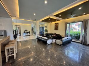
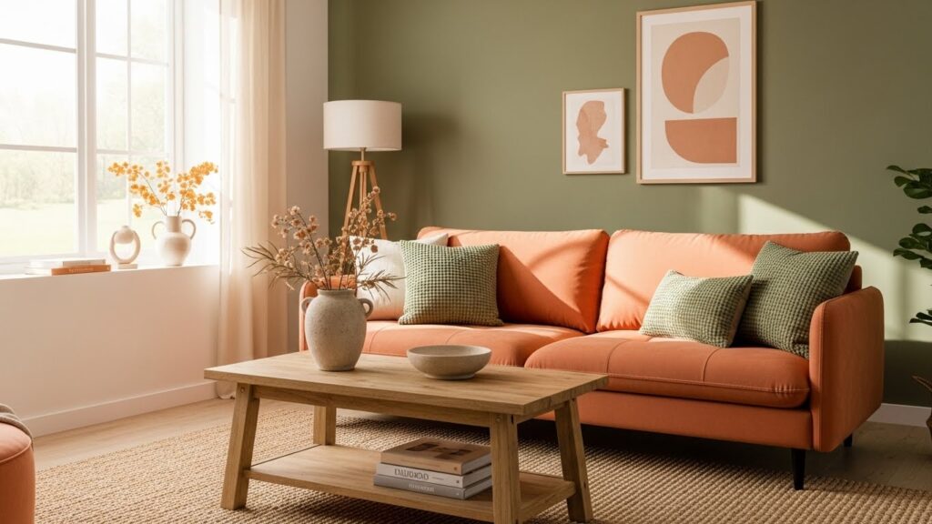
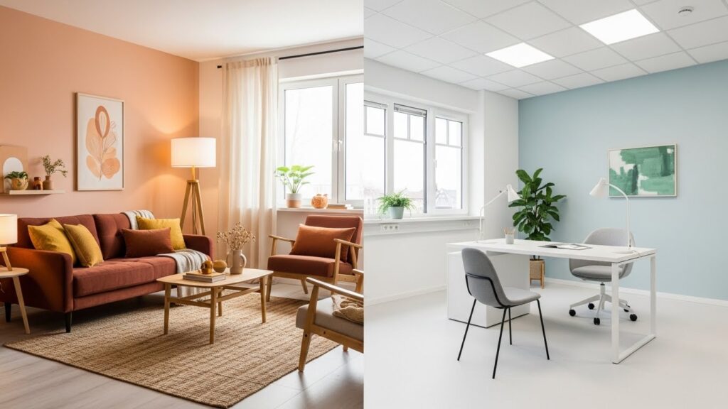
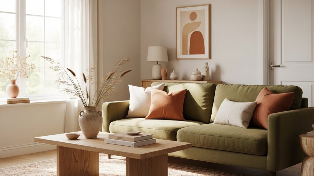
Living Room: Friendly, welcoming, “stay a while” vibes
Living rooms are social zones, so colour should feel warm, open, and flexible.
Great choices:
- warm beige / greige (versatile color)
- soft earthy tones
- a fun accent color like teal, terracotta, mustard, or olive
Want it more modern? Go neutral + black accents for sophistication.
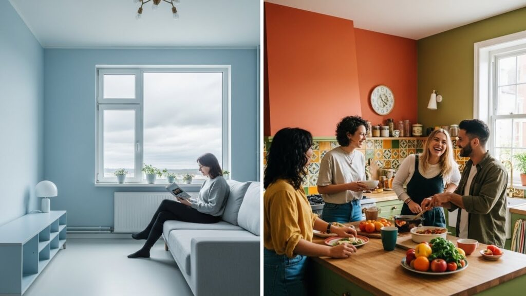
Kitchen & Dining: Energy + appetite (yes, it’s a thing)
Here the psychology behind colour gets interesting.
- Red is a colour known for stimulating appetite (that’s why you see color red in many food brands)
- warm colors like red and orange can feel lively and cheerful
- too much red everywhere can feel intense – use it smartly
Best approach:
Neutral cabinets + warm accents (backsplash, stools, décor). That’s effective color use without chaos.
Kids’ Room: Playful but not over-hyped
Kids need joy, but also focus and rest.
Try:
- softer versions of playful colours
- one bright zone (study corner wall or shelves)
- balanced palette so the room doesn’t feel like a cartoon explosion
Home Office / Study: Focus without feeling boring
For productivity, choose colours that feel steady.
Good options:
- muted blues/greens
- warm neutrals with a deep accent
- minimal, clean colour scheme with good lighting
Avoid overly loud walls if you already have a busy screen life.
Bathroom: Clean, fresh, light
Bathrooms benefit from:
- whites with warmth
- soft blues/greens
- stone shades and natural textures
Add contrast with mirrors, fittings, or one bold niche tile.
Recommended: The Importance of Focal Point in Interior Design
Popular Colour Choices in Modern Interior Design (and When to Use Them)
Some popular colour trends that work well in Kolkata homes (especially flats):
- Warm whites: airy, timeless, matches every design style
- Greige (grey + beige): modern but not cold
- Olive / sage: calm + premium look
- Terracotta: warm, earthy, heritage-friendly
- Deep blue: bold sophistication (great for feature walls)
Trends are fun, but the right color is the one that fits your light, layout, and lifestyle.
Use Color Like a Pro: Small Tricks Interior Designers Use
1) Create “space” with lighter walls
Light wall colour + minimal contrast can make small flats feel larger. This is a major win in urban interiors.
2) Use darker tones for depth (not everywhere)
A deep-toned accent wall can add richness and sophistication – especially behind a sofa or bed.
3) Soften color intensity with textures
If a colour feels too strong:
- switch to a softer shade
- pair it with warm wood
- add fabric textures
- choose matte finishes
This is how we keep an interior design scheme comfortable.
4) Balance warm color + cool color
A room feels best when there’s a temperature balance:
- warm color brings coziness
- cool tones bring calm
Together = harmony.
5) Repeat your accent colour 2–3 times
One accent cushion looks accidental. Three looks designed.
Understanding How Color Affects Interiors: Common Mistakes to Avoid
Let’s save you from regret-painting.
- Picking wall colour from a tiny swatch without testing
- Ignoring natural and artificial light
- Using too many vibrant color tones in one room
- Choosing a palette that fights with flooring/woodwork
- Overdoing complementary colors without balance
- Following design trends without checking comfort and function
Research on how colours influence emotional comfort and spatial experience in liveable interior spaces shows that poor colour decisions can negatively affect how a room feels – not just how it looks.
Remember: impact of colors in interior isn’t just visual – it’s emotional.
How CDI Approaches Colour Psychology in Interior Design (Simple, Transparent, Practical)
At Custom Design Interiors Pvt Ltd, our process is very “no confusion, no jargon” – something homeowners expect from a professional interior decoration company in Kolkata:
- We first understand your lifestyle (kids, storage needs, WFH, routines)
- We match colour selection with your layout + light
- We recommend a clear color palette with a workable design scheme
- We align colours with materials (wardrobes, kitchen finishes, furniture)
- We show it in 3D so you can see it before you build it
Because the biggest fear is real:
“Will the final work match the 3D plan?”
That’s why we keep everything aligned – design + execution – under one roof.
FAQs: Colour Psychology in Interior Design
1) What is the best color for a bedroom according to colour psychology?
Usually softer blues, muted greens, and warm neutrals work best because they support rest and calm. Strong colours like red can be used as accents but shouldn’t dominate the room.
2) How does natural and artificial light affect color perception?
A lot. Daylight can make colours appear cooler or brighter, while warm bulbs can make the same shade look more yellow. Always test samples at different times of day.
3) Are complementary colour schemes good for homes?
Yes – when balanced. Use one colour as the main tone and the complementary colour as an accent. Too much of both can feel visually loud.
4) What’s the easiest colour scheme for beginners?
Neutral base + one accent colour. It’s versatile, looks clean, and is easy to upgrade later with décor.
5) Can color psychology really change how a room feels?
Absolutely. Color can influence how people experience a space – calmer, more energetic, more spacious, more cozy – especially when combined with lighting and layout.
Ready to Choose the Right Color Without Overthinking?
If you want help creating a home that looks stylish and feels comfortable – without overspending CDI can help with everything from space planning + 3D to turnkey execution.
Call/WhatsApp: +91 84203 69659
Tell us your room + your vibe (calm? cozy? modern? bold?) and we’ll guide your color selection step-by-step – friendly, clear, and totally doable.