It’s not just the Italian marble.
It’s not just the custom furniture.
It’s the feeling.
That feeling almost always comes from the luxury color combination chosen for the space.
Because here’s the truth – in South Kolkata’s premium homes, colour is no longer decorative. It’s emotional. It decides whether your living room feels calm after a hectic day on EM Bypass… or whether it feels like a showroom you’re afraid to sit in.
At Custom Design Interiors Pvt Ltd, we’ve had countless homeowners sit across from us and say:
“We want something luxurious… but not loud.”
“It needs to feel end, but also cozy.”
“We don’t want it to look old in 3 years.”
That’s where a thoughtfully chosen color scheme really matters – something experienced interior decorators in south kolkata often focus on when designing premium homes.
Lets check out the classiest luxurious color combos that are popular for premium flats, in South Kolkata right now. And why they work well in actual homes not just online.
Why Colour Feels More Important in Premium Flats
In compact apartments, furniture fills most of the space.
In premium flats?
Walls breathe. Ceilings are taller. Natural light moves differently.
Which means your combination of colors becomes more prominent.
A random color combo might look fine in a sample catalogue. But in a 2,800 sq. ft. flat with open dining and living areas, poor planning becomes very obvious.
That’s why best interior designers in kolkata always focus on:
- Choosing a strong base color
- Selecting the right accent
- Applying proper color theory
- Using the color wheel intentionally
- Designing cohesive color schemes
Luxury isn’t about using four colors just because space allows it.
It’s about restraint. Balance. Understanding how colors interact.
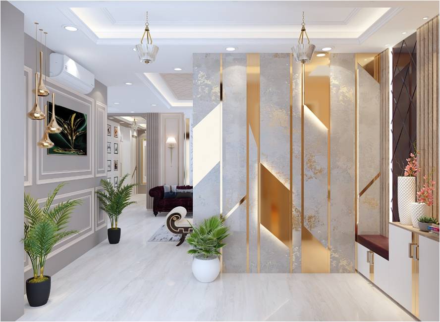
1. Warm Neutrals with Deep Teal – Calm, Rich & Confident 🤍🌊
Let’s start with one of the most loved luxury color combinations in South Kolkata homes.
Picture this:
Soft beige walls.
Cream upholstery.
Warm wooden textures.
Now add a deep teal accent. In a velvet chair or some statement artwork or even textured cushions.
Teal is a nice color that is, between blue and green so it looks great with warm neutral colors.
Here is why it works:
* Neutral colors are always elegant. Never go out of style.
* The teal adds some depth without being too much.
* The way the colors go together feels fancy. Also relaxed.
One of our clients told us that their place feels like a luxury hotel but they can actually live there. That is what we try to do with design. We want to find a good balance. We want the teal and the neutral colors to work well together in the room. The deep teal accent is what makes the room feel special. That is what we like about it.
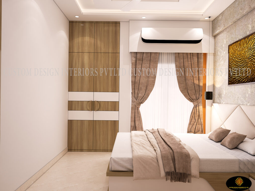
2. Mauve & Taupe – Soft Royal Elegance 💜
Mauve has quietly entered luxury homes.
Not loud purple. Not flashy lavender.
But soft, muted mauve layered with taupe and subtle grey.
This analogous color pairing (colours sitting next to each other around the color wheel) creates harmony.
It works especially well in master bedrooms because:
- Mauve brings warmth.
- Taupe grounds the space.
- Grey keeps it modern.
The key is proportion. Too much mauve can feel heavy. But when used as an accent against a neutral base color, it feels incredibly luxurious and sophisticated.
Lighting matters here. Under warm lights, mauve feels inviting. Under cool tones, it shifts entirely. Always test before committing.
Read more: 18 Top Modular Kitchen Design Trends Ideas 2026
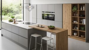
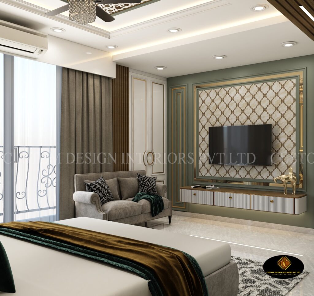
3. Shades of Green with Cream & Gold – Nature Meets Luxury 🌿
There’s something deeply calming about green.
From sage to olive to emerald, different shades of green bring quiet confidence to a home.
In premium flats with ample sunlight, pairing green with cream and brushed gold creates a refined luxury color effect.
You can even create a monochromatic color combination by using one color – green – in various intensities across:
- Walls
- Sofas
- Accent décor
This layering of different shades adds depth without chaos.
And from a color psychology in interior design perspective?
Green symbolizes balance and prosperity – something many homeowners subconsciously connect with.
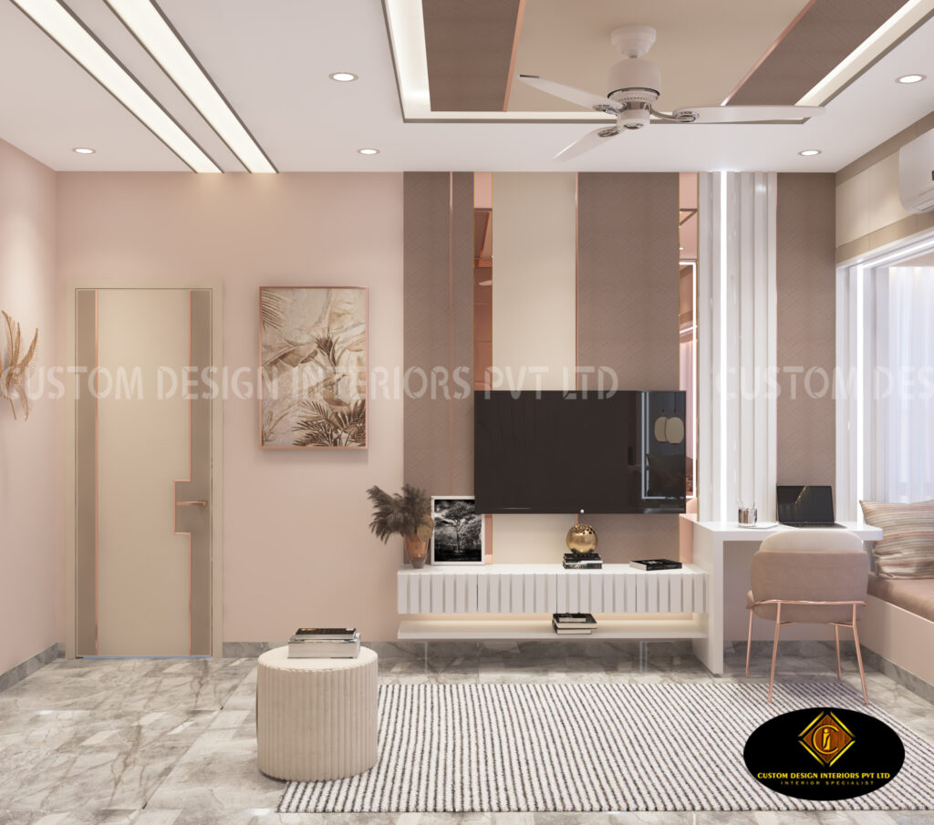
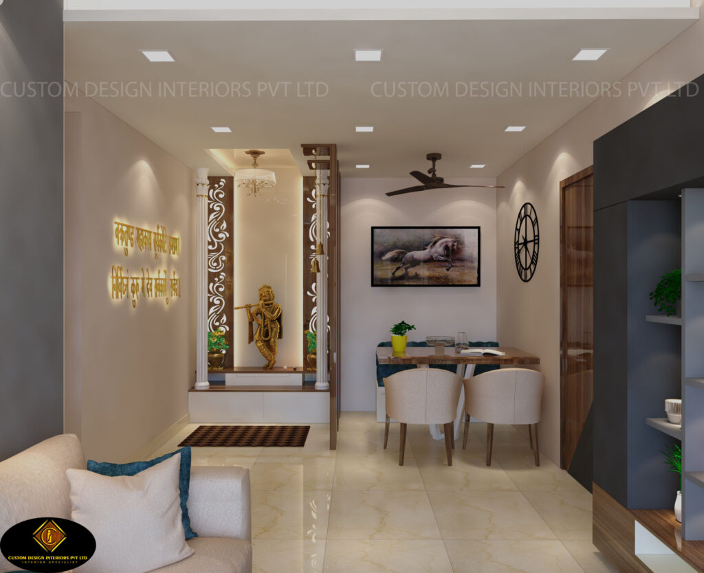
4. Shades of Pink with Charcoal – Modern Yet Warm 🌸
Many homeowners hesitate with pink.
But muted shades of pink like dusty rose or blush, when paired with charcoal grey or matte black, create a high-contrast color pairing that feels modern and bold.
This is a dynamic color combination perfect for:
- Dining areas
- Guest bedrooms
- Feature lounges
Pink becomes the soft color element.
Grey acts as the anchor.
The balance between primary and secondary colors is important here. Too much pink feels overwhelming. Too much grey feels cold.
When done right, it radiates elegance.
5. Different Shades of Blue – Timeless and Trustworthy 💙
There’s a reason many luxury brands use blue in their brand color palette.
Blue communicates stability and confidence.
In premium flats, different shades of blue – navy, steel blue, powder blue – create depth.
Using blue as the base color and layering lighter tones creates a monochromatic color combination that feels cohesive.
Pair it with warm wood and subtle brass accents to avoid making the space feel too cool.
Understanding how colors interact is crucial here – especially with lighting variations throughout the day.
Recommended: Local Carpenter vs Interior Designer: What’s the Right Choice?
6. Soft Yellow with Greige – Understated Warmth ☀️
Shades of yellow don’t have to be bright primary color tones.
Muted, buttery yellow paired with greige creates a soft color luxury palette.
This analogous color approach works beautifully in formal living rooms and study spaces.
It brings warmth without overpowering.
The trick?
Use this color sparingly as an accent rather than a prominent color across all walls.
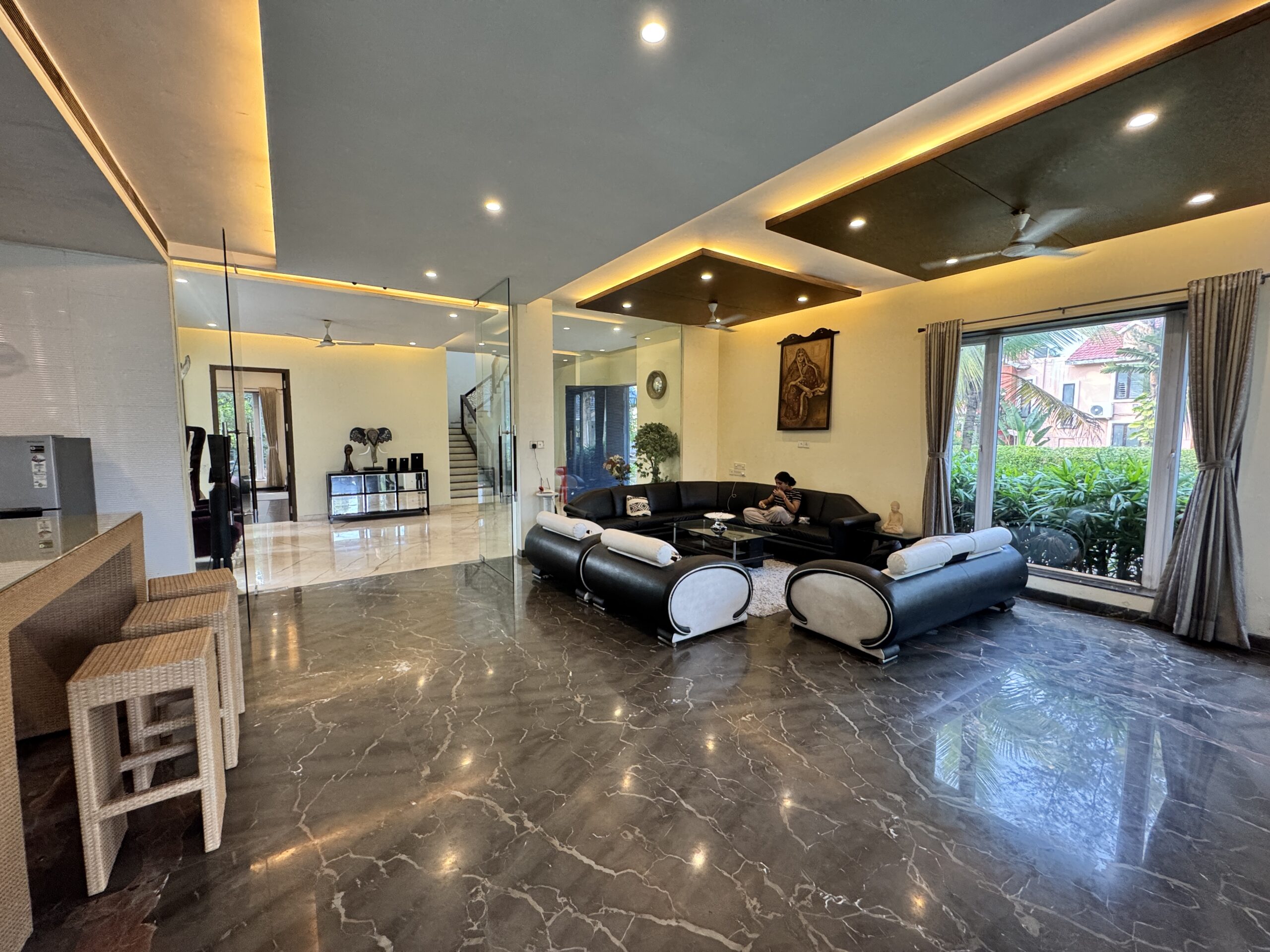
7. Black & Ivory – Two Colors, Maximum Drama 🖤
Sometimes, two colors are enough.
Black and ivory create a bold, high-contrast color luxury look that never goes out of style.
Ivory remains the base color.
Black works as the accent.
This combination feels powerful, especially in homes with statement lighting and sculptural furniture.
But restraint is everything. Black should enhance – not dominate.
Read more: 12 Things to Remember While Making a Modular Kitchen | CDI Kolkata
Understanding Types of Color Combinations
When homeowners ask to see “100 color combinations,” we gently explain something important.
Luxury isn’t about options.
It’s about intention.
Different types of color combinations include:
- Complementary color (opposites around the color wheel)
- Analogous color (neighbors around the color wheel)
- Tetradic color (four colors carefully balanced)
- Monochromatic color combination (one color in different shades)
The goal isn’t to experiment with every color type.
The goal is to create a color scheme that flows naturally from living room to dining to bedroom.
Practical Design Tips for South Kolkata Homes
Here are some honest design tips we share with every client:
- Study natural light before choosing your palette.
- Avoid overly cool tones in shaded flats.
- Keep one prominent color per major space.
- Don’t mix too many different shades without structure.
- Maintain a consistent brand color palette for your home.
- Coordinate lighting with your chosen color schemes.
Think of your home like a website color identity. Just like a website color defines a brand, your home’s palette defines its personality.
Conclusion: Luxury Is in the Balance
A true luxury color combination is not accidental.
It’s thoughtful.
It respects color theory.
It understands color psychology.
It balances base color and accent.
It uses primary and secondary colors wisely.
This is something experienced interior decorators in south kolkata always consider when designing premium homes.
In South Kolkata’s flats, spaces look their best when the palette is simple and calm. They do not need to have every color you can think of.
They do not need to have every color you can think of.
When you pick the colors and put them together it is really nice.
The home feels calm.
It feels confident.
It feels luxurious and sophisticated.
The best part is. The home feels like the South Kolkata flats are yours.
Ready to Design a Home That Feels Effortlessly Luxurious?
At Custom Design Interiors Pvt Ltd, we don’t just help you pick a color combo.
We help you create a complete interior design story – from selecting the perfect luxury color combination to full turnkey execution.
We ensure:
- A balanced color palette
- Smart accent placement
- Thoughtful color schemes
- Practical design tips
- Premium finishes that age beautifully
📞 Call / WhatsApp: +91 9429693643
📍 Serving South Kolkata & East India
🌐 Visit: https://customdesigninteriors-pvtltd.com/
Let’s create a home where every shade feels intentional – and every room reflects true elegance.